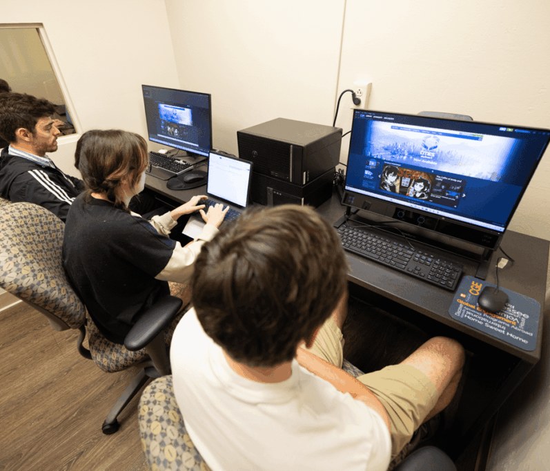

UTK Innovation Labs
Designing experiences with intention behind every interaction.
Prev. UX Intern @ UTK Innovations and UX Lab









01 / 03
Role
UX Intern
Tools
Claude Design, Figma
Skills
UX Research, Usability Testing, Product Design
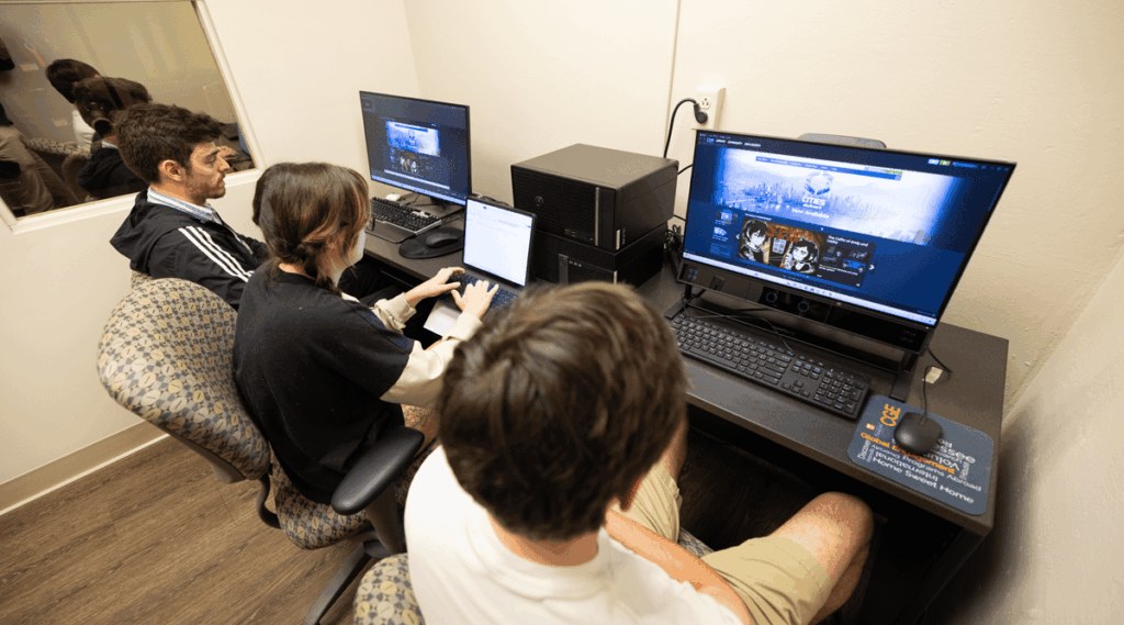
A full website redesign for UTK Innovation Labs that helped the lab connect with new business clients.
A quick scroll through the redesigned UXL page, from the hero to the contact form.

"The overarching goal of the UXL's public-facing website is to acquire new business."
My internship project was a semester-long UX study of the lab's website. I ran research, interviews, and usability tests to uncover the pain points users were running into, then turned those findings into a full website redesign built to address them.
I ran 9 interviews and usability tests with students, faculty, and former clients to uncover pain points and learn what prospective clients needed to understand about UXL's services.
I analyzed 30+ university and business UX lab websites to benchmark UXL's digital presence.
I evaluated the current UXL website against usability heuristics and accessibility guidelines.
There was no clear way to contact the lab.
Email links opened Outlook or made visitors copy the address. Like many sites I benchmarked, the redesign adds an on-page contact form and more contact buttons.
Past work wasn't being showcased.
Without examples of past projects, new clients had a hard time seeing what the lab could do or what working with it looks like.
Services and rates were unclear.
Visitors needed a clearer breakdown of what each service includes and what it costs, so the redesign shows rates by audience type.
The site needed more description and imagery.
The redesign adds a fuller about section and photos in key sections, like the facility and equipment, to show what the lab offers.
I created three personas for the three audiences the lab wants to serve: students, academic researchers, and business clients.
Undergraduate Student, Information Sciences
Age
20
Audience
Student
Tech comfort
High
Background
Goals
Pain points
Associate Professor, School of Information Sciences
Age
44
Audience
UT Researcher
Tech comfort
Medium–High
Background
Goals
Pain points
Product Manager, Regional Healthcare Company
Age
36
Audience
Business Client
Tech comfort
Medium
Background
Goals
Pain points
Students, researchers, and business clients came to the UXL website with different needs, but it didn't clearly show what the lab offers, what it costs, past work, or how to get in touch, so prospective clients left.
Redesign the UXL website so every audience can find the lab's services, rates, and past work, and reach the team in a few clicks to win new clients.


I presented research findings, design recommendations, and interactive prototypes to leadership for review and approval. The designs are being considered for future development and laid the groundwork for a future redesign.
The interviews, usability tests, and competitive analysis gave me evidence behind every change, so the redesign solved real problems instead of assumptions.
Students, researchers, and business clients all needed different things from one page, so I layered content, like the rates toggle, while keeping the lab's goal of winning new clients in mind when deciding what came first.
Presenting to leadership taught me to explain my process in plain language and connect each design choice back to the lab's goals.
Curious about my work at this internship? Please feel free to reach out to me at luongeric0207@gmail.com.
02 / 03
Role
Product Designer
Tools
Figma
Skills
UI/UX Design, Wireframing, Prototyping
I partnered with another designer to design the application and dashboard interfaces for SCF's “Rigs Without Cigs” program, for both the truckers applying and the staff reviewing their applications.
Curious about my work on this project? Please feel free to reach out to me at luongeric0207@gmail.com.
03 / 03
Role
Product Designer
Tools
Figma
Skills
UX Research, Wireframing, UI Design
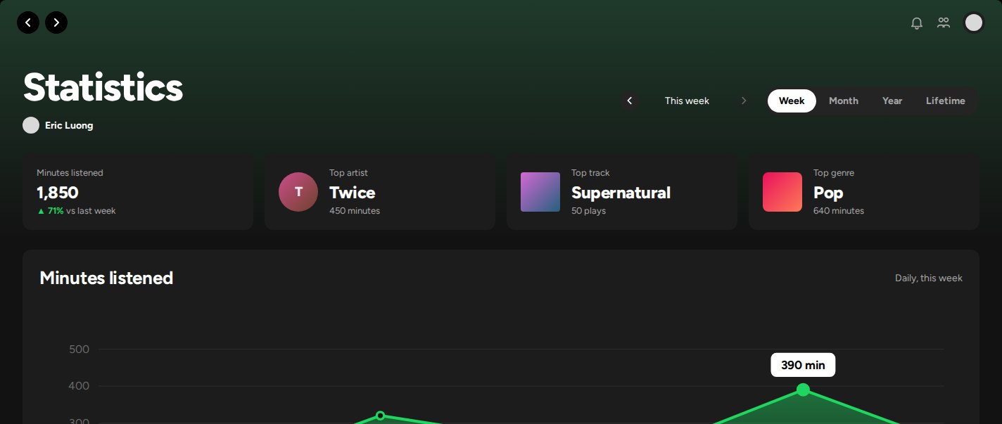
Spotify gives artists a place to share their work with millions of listeners, and gives fans a way to enjoy it. As a longtime Spotify user, one of my biggest gripes is how little of my own listening data I can actually see.
Spotify Wrapped, the personalized summary of each listener's year, made that gap obvious. If Spotify already collects all of this data, why isn't there a page where listeners can explore it throughout the year? This side project is my answer: a statistics page that is always there, not just at the end of the year.
A quick walkthrough of the statistics page, from switching time ranges to opening the top artists page and sharing stats.

As a long-time Spotify user, one of my biggest gripes is how little of my listening data I can see. Spotify Wrapped shows a personalized summary of my year, but only once a year. This class project set out to give listeners that data all year long.
I interviewed three Spotify users about their opinions on Spotify and what they would want to see on a statistics page.



There was no year-round access to listening stats.
Wrapped only arrives at the end of the year, so listeners had no way to check their stats in between.
Past listening data was out of reach.
Listeners couldn't look back at earlier weeks, months, or years to see how their habits changed.
Listeners wanted more kinds of statistics.
Beyond the familiar top artists and tracks, they wanted different types of stats, including unique ones they don't usually get to see.
I created John Lee to represent the listeners who would benefit from and enjoy a statistics page.
Student, University of Tennessee Knoxville
Age
20
Location
Knoxville, TN
Hobbies
Fashion, music, soccer
Wants
Socials
Bio
John is a student at the University of Tennessee Knoxville. He is outgoing, loves connecting with people, and enjoys learning more about himself and others. He is active on social media and hopes to work in the industry. He loves artistic activities and diving deeper into his interests, and music is one of them: he loves listening to it and sharing it with other people.
Listeners have no year-round access to their personal listening statistics.
There's no way to look back at past statistics and listening history.
Spotify misses a chance to keep listeners engaged on the platform.
A dedicated page where listeners can view and interact with their listening history and data.
An interactive interface that lets listeners expand any statistic and choose the time range they want to see.
Continuous, year-round access to personal listening data.
Every part of the page traces back to a problem from Define: listeners had no year-round access to their stats, couldn't look back at past data, and had little reason to keep coming back.

Time range toggle and period arrows
Week, Month, Year, and Lifetime, plus arrows to step back through earlier periods, give listeners year-round access and a way to revisit past listening data whenever they want.
Summary tiles

Minutes listened, top artist, top song, and top genre sit at the top so listeners get the answer at a glance before deciding what to explore.
Statistics listeners care about most
Minutes listened, top artists, top songs, and top genres reflect what my interviewees wanted to see most. Each one has a format that fits it, like a chart for listening over time and colored bars for genres, and Show all opens a full top 50 for anyone who wants to dig deeper.
Share with friends
A shareable stats card encourages engagement and social sharing, giving listeners a reason to come back throughout the year, not just when Wrapped drops.
Coming back to the project, I reworked the page into a dashboard: summary tiles for each statistic, one time range control for week, month, year, and lifetime, a chart that adapts to the range, and lists that expand in place.
Switch the time range, step back through past periods, open the top 50 pages, and use the arrows to move back and forth.Open this page on a computer to try the interactive prototype.
Minutes listened
Top artist
Twice
minutes
Top song
Supernatural
plays
Top genre
Pop
minutes
Twice
Top song: Dive
NewJeans
Top song: Hurt
IVE
Top song: I AM
ILLIT
Top song: Magnetic
LE SSERAFIM
Top song: EASY
Supernatural
NewJeans
Hype Boy
NewJeans
Super Shy
NewJeans
Hurt
NewJeans
Cookie
NewJeans
Send these highlights to friends or post them to your story.
Eric's stats ·
minutes listened
Share to
· Your top 50 artists
· Your top 50 songs
Supernatural
NewJeans
Hype Boy
NewJeans
Super Shy
NewJeans
Hurt
NewJeans
Cookie
NewJeans
Right Now
NewJeans
How Sweet
NewJeans
OMG
NewJeans
Ditto
NewJeans
Dive
Twice
I AM
IVE
Magnetic
ILLIT
EASY
LE SSERAFIM
Supernova
aespa
Espresso
Sabrina Carpenter
ONE SPARK
Twice
HEYA
IVE
Psycho
Red Velvet
Pink Venom
BLACKPINK
Juna
Clairo
From The Start
Laufey
Snooze
SZA
Pink + White
Frank Ocean
seasons
wave to earth
Plastic Love
Mariya Takeuchi
Cherries Jubiles
Yerin Baek
AEAO
DYNAMICDUO
For Lovers
Lamp
Welcome to the Show
Day6
LALALALA
Stray Kids
Queencard
(G)I-DLE
Teddy Bear
STAYC
Midas Touch
KISS OF LIFE
SHEESH
BABYMONSTER
Cruel Summer
Taylor Swift
we can't be friends
Ariana Grande
BIRDS OF A FEATHER
Billie Eilish
Good Luck, Babe!
Chappell Roan
Seven
Jungkook
Sparkle
Tatsuro Yamashita
Shinunoga E-Wa
Fujii Kaze
Idol
YOASOBI
Glimpse of Us
Joji
Glue Song
beabadoobee
Bad Habit
Steve Lacy
Always
Daniel Caesar
See You Again
Tyler, The Creator
Paint The Town Red
Doja Cat
XO
ENHYPEN
Snowman
Zion.T
Defining the problem, goals, and user needs before wireframing gave every later decision a clear reason.
Next time I would spend more time sketching and wireframing before settling on colors and typography, because planning the information architecture, user flows, and interactions is what matters most.
Good design pairs an interface that is easy to use with one that looks good, and each should support the other.
Curious about this project? Please feel free to reach out to me at luongeric0207@gmail.com.