Spotify Statistics Page

Spotify Statistics Page

Overview
This was my first time ever doing a case study. This was a solo project and I did all of the research, wireframing, prototyping, and story telling myself.
Context
Spotify is an audio streaming platform where artists are given the freedom and opportunity to showcase their art to billions of people and fans the ability to enjoy their art.
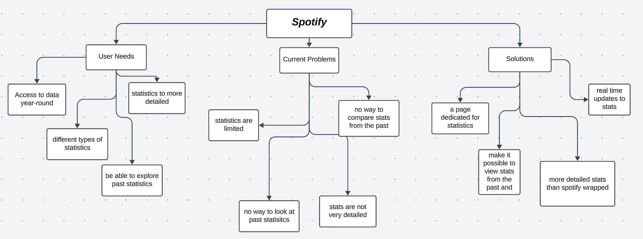
I was inspired to do this case study because as a long time Spotify user, one of the main gripes I have with it is the lack of stats that are unavailable to the user. This was brought to my attention with Spotify Wrapped, an annual feature that provides users at the end of the year where they showcase them a personalized summary of their listening history and habits of that year. This brought to my attention that if Spotify has collected all this different type of data on the user, why is there not a page where users can look at this type of data throughout the year?
The Problem
The Solution
Research
I moved on to conducting user interviews for my solution. I interviewed 3 people asking them about their opinions on Spotify and what they would like to see in a statistics page.


I was then able to find the key pain points my interviewees had and I was then able to create an affinity diagram based off of it.

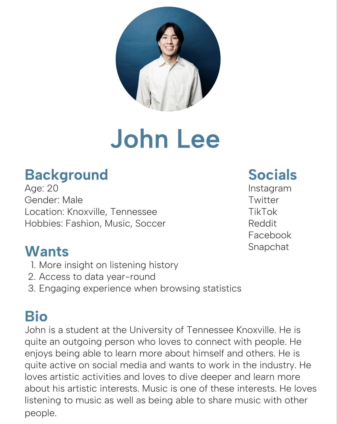
Through this I was able to create a user persona to help better visualize the audience I am designing this feature for. I created this user persona because I felt like people like John Lee would benefit from and enjoy the new statistics page.

Early Ideation
I started off my design process by sketching out the layouts of the pages I wanted to create. This was to give me some ideas to bounce off of myself and a base to start on.
I then went ahead and started to wireframe my designs. I created the whole process of how the user would be able interact with the entire statistics page I was creating.
I started off with designing the steps on how the user would access the statistics page. I made it another option in the dropdown menu when users clicked on their profile picture. I think this makes it very easy to access for the user.
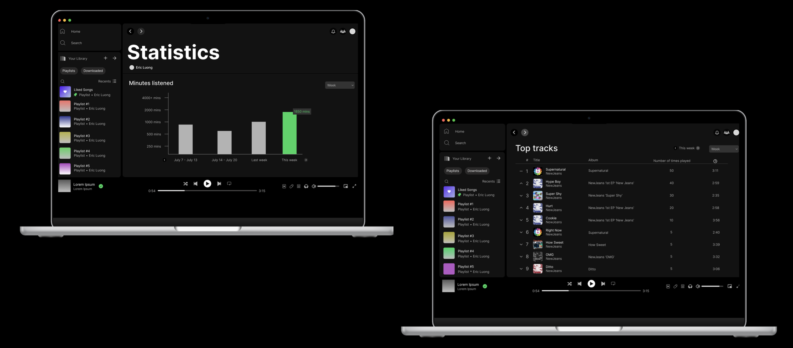
The first statistic I chose to do was the minutes listened graph. I chose to do a bar graph to display the information because I felt like it was an easy way for the users to see this statistic visualized and make it very easy to compare with other times as well.
I then went on to design the other 3 statistics I wanted to showcase on this statistics page. I formatted them similar to how Spotify had already displayed the top artists they already have on their platform. I decided to add more details for each statistic so the user can have more insight over their listening history. They all have similar layouts to continue design continuity for the user to easily navigate through. On the left are how the statistics would like on the main statistics page. On the right are how they would look if the user clicked on show all.
Top Artists Page
Top Tracks Page
Top Genres Page
Final Design
How To Get To Statistics Page

Minutes Listened Page

Top Artists Page

Top Tracks Page

Top Genres Page

Takeaways
This is the first case study I had ever done and I have learned so much from doing this. I decided on doing a Spotify Statistics page because it had been something that I have wanted on the platform since I started using many years ago. I think that when entering the beginning stages of this case study I did not realize how important it was to get the planning part of the process right. Steps like establishing a problem and a goal, creating a vision statement, and doing user research helps build a platform for you to go ahead and create wireframes and final designs.
I think that through this case study I have become so much more familiar with Figma and how to use it. I learned how to format a case study and realized that every part of the process has a meaning to it and they all bounce off of each other to create a story.
The things I would do differently would be putting more effort into wireframing and sketching before worrying about the final designs and what the colors should be on the background of the statistics page or if I should make this text bold or not. The most important and fundamental parts of a design is having a good user friendly interface balanced with aesthetics.